

Project overview
- Client work
- Agency: Electric Studio
- Year: 2023
- Duration: 9 Months
- My Role: User Flows, Wire framing, UI/UX Design, Prototyping, User Testing
Context
Nitron specialises in crafting top-quality automotive and motorcycle suspension systems driven by innovation, precision, and a strong commitment to quality.
Aside from customised designs and low-volume production, Nitron excels in large-scale manufacturing, directly supplying vehicle manufacturers.
Project Goals
The aim would be to streamline the product discovery process, enhance product information clarity and effectively communicate the value and benefits of their flagship shock absorber systems.
The key challenge was the nature of this core product offering, we needed to create an experience wherein the user feels confident that they have purchased an upgrade to their vehicle that is not only worth the investment, but is compatible and can be maintained.
Designing the Solution
Research & Planning
As access to some of the high profile clientele Nitron produce parts for, due to NDAs direct contact was not an option. So we elected to create customer archetypes (or Persona Groups) rather than traditional personas. This we defined as:
- Enthusiast; someone who attends track days on a regular basis and would be comfortable tinkering on and improving their own vehicle.
- Collector; someone who is interested less in personally upgrading and maintaining their own vehicles, but is no less invested in and wants the most out of their pride and joy. This user would be reassured by ease of access to local specialists for part fitting and maintenance.
- Professional; we concluded that both dealerships and manufacturers had more similarities than differences in terms of what they would require from Nitron, so for the sake of simplicity we merged these two potential archetypes.
Information Architecture
Our user research uncovered clear pain points that we needed to address with our design. The user needed to feel confident they were selecting compatible parts without resorting to speaking to customer services. They needed to be reassured that specialists are easy to locate for replacement parts, fitting & maintenance. The structure of the existing (at the time of writing) website matched fairly closely to our findings, albeit lacking in the features and capabilities that we required to meet the needs of our archetypes.
User Flows
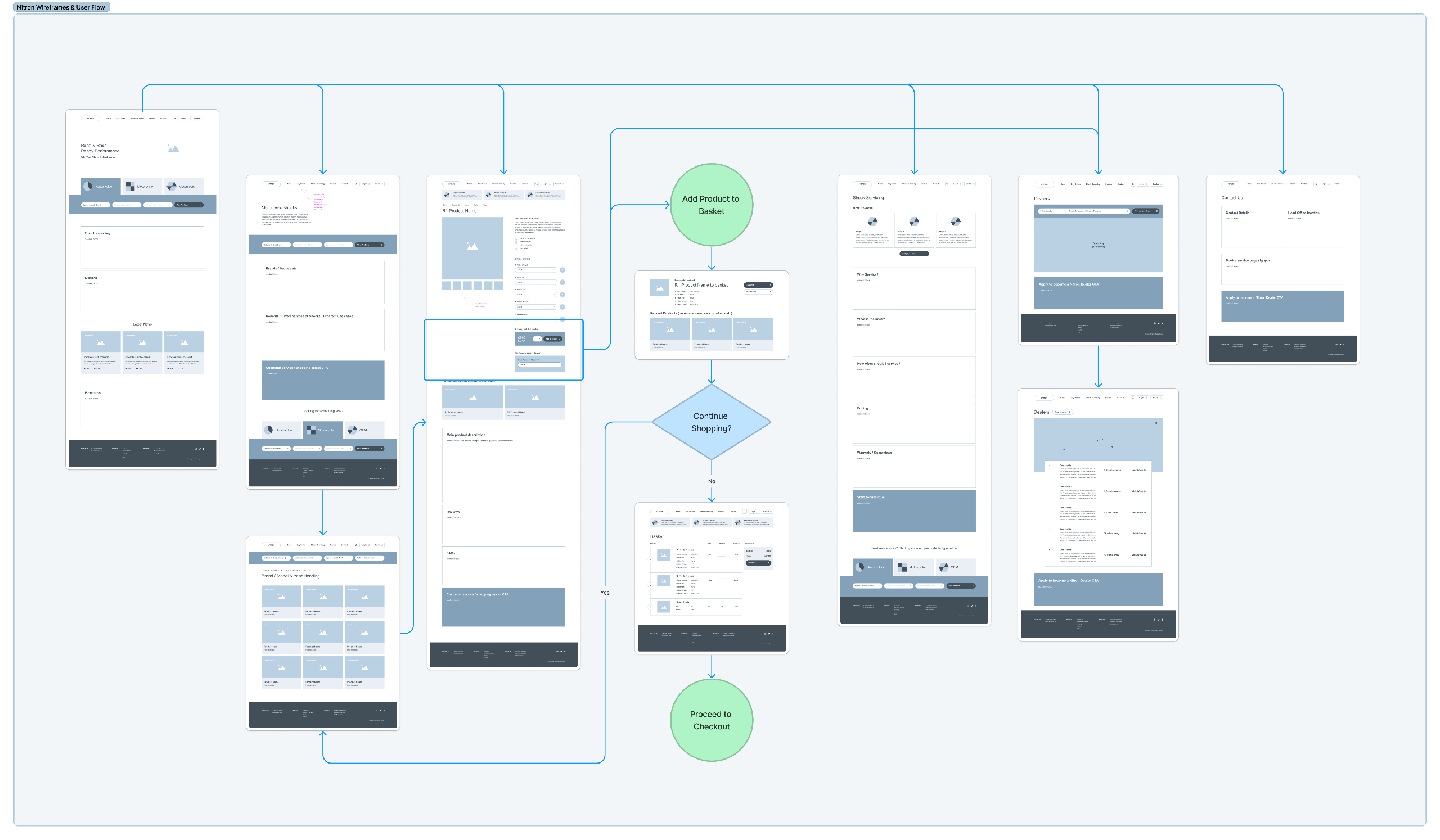
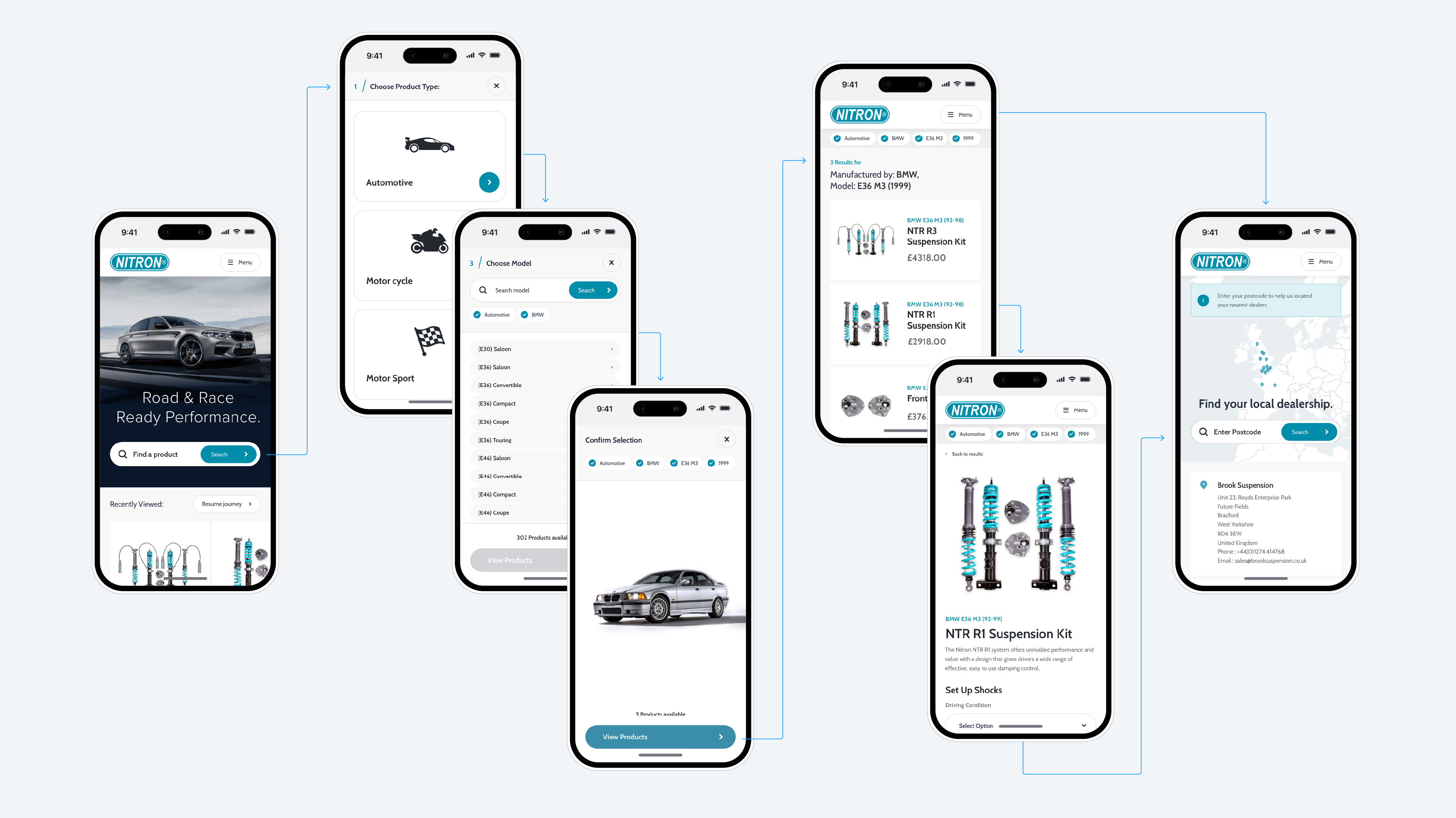
I created user journey maps to establish critical paths through the site from landing (initially from the homepage, followed by additional entry points as we progressed) to checkout.
One solution we came across while conducting competitor analysis during discovery was a faceted search from the homepage: three drop-down selects that refines search results by make, model & year, which formed the basis for the early wire framing & lo fi prototyping exercise.
UI Designs
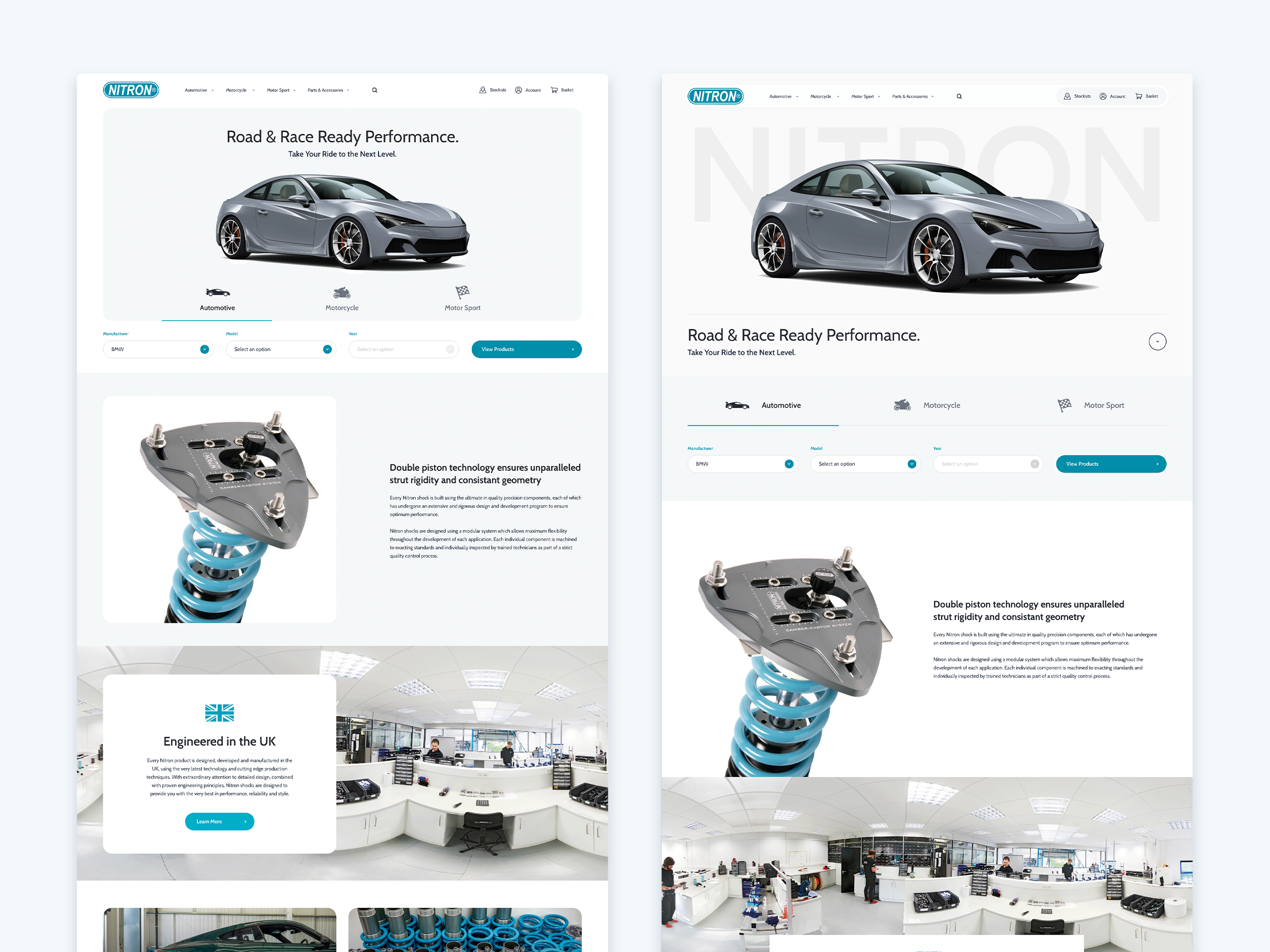
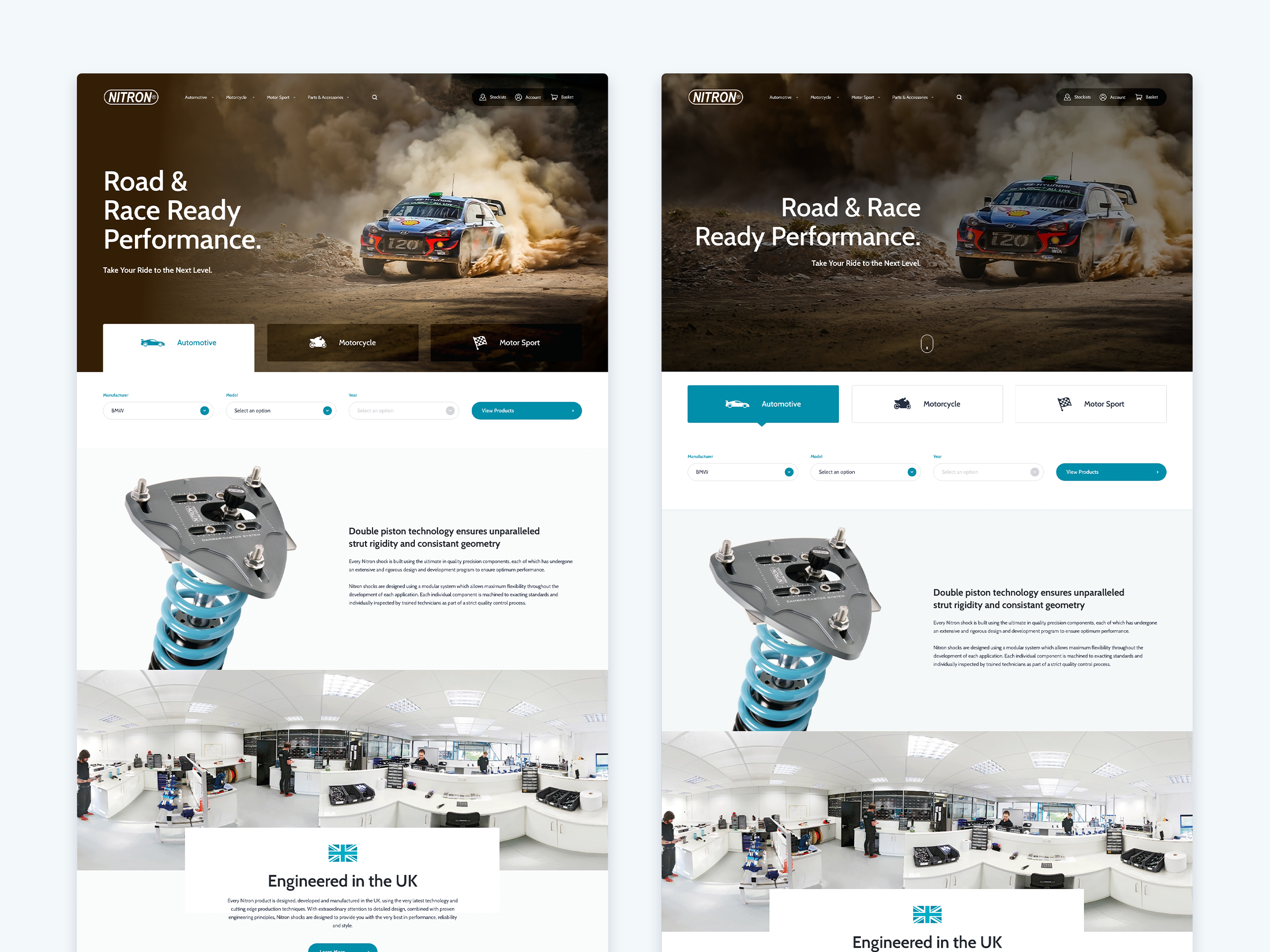
I conducted several rounds of exploratory design work to establish the direction we would take the visuals. Ultimately we wanted to emulate the look of an ultra clean lab environment; to sell the idea that these parts are precision engineered to a high specification.
User Testing
As the project progressed we realised we wanted to build off and improve the implementation; we had originally planned on using tabs to direct the user to the parent category and facet filters. However, on testing the key stakeholder’s preferred design option, it was evident that this crucial component could easily be overlooked.
The first prototype shows a (reasonably accurate) reenactment of the users behaviour when observed during testing. Due to positioning & a lack of contrast to grasp the user’s attention, we realised the initial solution required iterating on.
Other feedback gathered expressed a desire to navigate via breadcrumbs, which were rendered obsolete by the facet filter (navigating the user directly to results, rather than in the segmented method required for breadcrumbs).
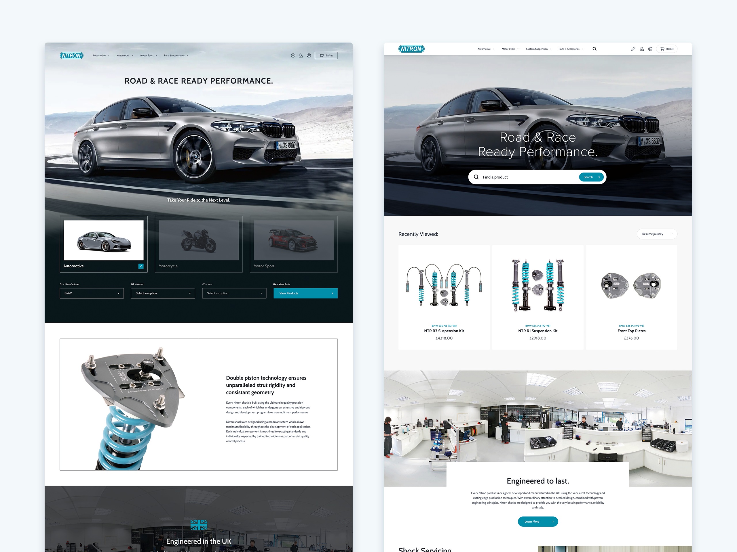
The solution I proposed was to replace the with a smaller component that I could include in a more prominent position; opting for a search field (as a button did not have the presence) to enable the off-canvas search. This would allow the user to adjust their results without starting over, clear stages we could hook breadcrumb functionality into and marry this up with a consistent UI.
Measuring our efforts
As the goal was to transform the website into an intuitive, informative, and convincing platform that encourages and simplifies the purchase process for our customers, these key metrics for success were at the forefront of any decisions made during the design process.
By achieving these goals, I would expect to see an observable increase in sales. An enhanced user interface and curating the product descriptions in a clear & concise manner will reduce user confusion, resulting in reduced bounce rates. A greater understanding of the benefits of Nitron’s products through a combination of video content and customer reviews will result in more customers being confident in their purchasing decisions.
Reflections
From a design perspective, I was delighted with the client’s active engagement and their willingness to explore the suggested improvements. In hindsight I learn’t that there’s opportunity to optimise time management by dedicating more resources to thorough testing during the initial stages of prototyping, valuable insight I will take forward to future projects.